_edited.png)

Siteimprove is a SaaS company which works on increasing online traffic for other companies by increasing the accessibilities and SEOs. Frontier is the Learning Management System (LMS) for Siteimprove which provides courses on accessibility, inclusivity, and customer service.
Role
Interaction designer,
User Experience Designer
Tool Kit
Figma, Storyline, Evolve, Photoshop, Illustrator
Team
Soumya Sharma,
Dave Zinsman,
Juan Siera
There are so many places to visit in a new city. but how can users know what is best for them. for example, a person who like to party will not be able to figure our which pub is the best to visit in the city. To provide more information to the user, the app will has to collection information from the users and should also have data to present to the user.


Task at hand
-
The Learning Management System (LMS) needed a revamp and rebranding to enhance user engagement and improve the overall user experience on the website.
-
Increased User Engagement: The LMS revamp aimed to boost user engagement by introducing innovative features and redesigning the user flow. This encouraged users to actively participate and interact with the platform, resulting in a more immersive learning experience.
-
Enhanced User Experience: The revamped LMS addressed the identified pain points, ensuring a seamless and enjoyable experience for users. Intuitive design principles were implemented to improve navigation and user satisfaction.
-
Restructured User Flow: By analyzing the existing user flow, areas that required improvement were identified. The revamped LMS reorganized and optimized the user flow, enabling users to navigate through the platform more efficiently and access desired features with ease.
-
Introduced New Features: The LMS incorporated new features to enrich the learning experience. Interactive learning modules, personalized recommendations, social learning communities, and gamification elements were added to cater to diverse learning preferences and foster user engagement.
-
Improved Website Accessibility: Accessibility was prioritized during the revamp, with adherence to WCAG 2.0 (Web Content Accessibility Guidelines) standards. This ensured that users with disabilities could access and interact with the platform using assistive technologies, providing equal learning opportunities for all.
-
Fostered Inclusivity: The revamped LMS aimed to accommodate users from diverse backgrounds and learning styles. User feedback and research guided the implementation of inclusive design practices, making the platform more welcoming and accommodating to all users.
Results
Increased User Engagement:
Production Launch Date: 11/7/2022
Full Launch Date: 2/3/2023
Key Components & Set - up
Clean and branded user experience
Content Discoverability
Streamline Login
with SSO
Launch Process
-
Hit the ground running with course/site curation
-
Upleveled the site with proserve to create a strong branded experience.
-
Identified and prioritized technical needs: SSO
61/92
Days to production/full Launch
2
Domains Launched
78
Courses Published
Usage from Launch Day:
2.20k
Domain-registered Students
1.11k
Active Students
3.68k
Course Registrations
812
Course Completions
651
Total session hours
Quick Facts
User Research
- Gain insights into the basic user needs.
-
Conduct comprehensive market research.
-
Analyze the visual elements of various learning-focused platforms to learn essential insights.
Target Audience
-
Other SaaS companies
-
Corporate Employees
-
HR Professionals
-
Freelancers
-
Educators
-
Accessibility-focused learners
Empathy Map

Competitive Analysis
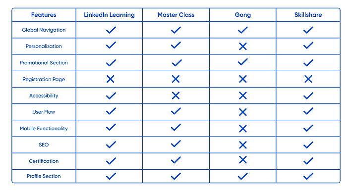
During the initial research, the competative analysis was an important aspect to determine what feature might work for Frontier's LMS. This process involved a lot of research on the other companies that offer courses to the users, I realized a lot of these LMS have sub courses inside one course which was confusing to navigate. The users can easily lose interest in the course and might forget to take important courses. Some of the LMS has really good graphics but the user flow was confusing. There were some good interactions that helped in understanding the promotional aspect of the courses.
Gong


LinkedIn Learning


Taxonomy
In developing Frontier's taxonomy, we used user-centric design principles to establish both organizational and product taxonomies that highlighted the overall structure as well as detailed offerings of the application.
Organizational Taxonomy
The Organizational Taxonomy revolved around categorizing elements based on stakeholders and operational functionalities at a high level, offering a bird's-eye view of Frontier’'s framework.

Product Taxonomy
The Product Taxonomy focused on categorizing courses, resources, and live events. Courses were categorized to showcase diverse subjects, resources were structured to present the array of materials available to users, and live events houses in-person and online events. Tags were strategically employed to associate relevant attributes with courses, providing users with a nuanced and efficient way to navigate through the diverse offerings within Frontier.

Information Architecture
In shaping Frontier's Information Architecture, I approached it as crafting a strategic blueprint for a learning expedition. This process resembled planning a well-structured city, ensuring clear pathways and focal points for users. My focus was on organizing information logically, creating clear navigation, and using meaningful labels. I also considered search functionality and prioritized the user's needs and mental models. The goal was to make information easily accessible, reduce cognitive load, and improve the overall user experience.
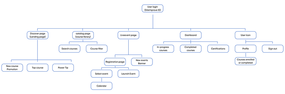
User Flow
The aim was to manage and personalize the courses for the customers to achieve the best results for the website. The landing page had the most essential feature of the product which included top courses, power tips and new promotional course for the users. The top navigation includes course library, live- event page, personal dashboard which includes in progress courses, completed courses and all the certification. The user icon will lead to the user's profile where they see all the statistic of their courses and also able to log out of the LMS. The live-event page will let the users sign-up for an upcoming new event in their city and all the information related to the event. The User flow is the most efficient way to meet all the requirement which does not include many options that can confuse the users for the LMS.


Low - Fidelity Wireframes
With low-fidelity designs, I outlined the basic structure of different screens in Frontier. These early sketches gave us a roadmap, focusing on the overall layout without diving into the nitty-gritty details. It was a practical starting point for shaping the user experience.

High - Fidelity Wireframes
Transitioning to high-fidelity designs, I added detailed labels, refined the layout, and fine-tuned the navigation. These polished designs went beyond the basics, showcasing a more structured interface. It provided a visually rich preview, ensuring a thorough understanding of the final look and functionality, setting the stage for a strategic iterative design cycle.

Theme Exploration
Before diving into the design phase, we explored 2 themes - a futuristic space theme and a modern minimalist theme. Through collaborative efforts with stakeholders and cross-functional teams, we collectively determined that the modern minimalist theme resonated better with user needs and aligned well with our product goals. This decision was based on a user-centric approach, ensuring that the chosen theme not only met aesthetic preferences but also complemented the overall user experience within Frontier.


Branding
After conducting user testing and considering the user flow, we decided it was time for a website makeover that aligns with Siteimprove's brand values. The team collectively opted for a design that embraces the company's colors, enhancing accessibility and inclusivity. The addition of a white background significantly improved the visual experience, making our website more user-friendly.
Design System (Component Library)

Strategic Iterative Design
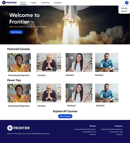
Phase 1 - Discover
In the first phase of strategically redesigning Frontier, I revamped the Discover page from the ground up. This wasn't just a facelift but a thoughtful reconstruction, blending product and strategy design principles. Using insights from user feedback and market trends, I reimagined the dashboard to be more user-friendly and aligned with contemporary design standards. The aim was clear: to boost user engagement and simplify the learning experience. This initial overhaul set the stage for the next steps in reshaping Frontier's design with a strategic focus. As I directed the product and content designers, our collective efforts pivoted Frontier from a passive homepage to a dynamically active, user-centric interface, intertwining continuous personalized suggestions with substantive feedback.
Before
The previous version of the Discover page had an outdated user interface that did not adhere to modern design principles and lacked accessibility features. The dated design compromised the user experience, necessitating a comprehensive redesign to align with modern design aesthetics.

After
.jpg)

_edited.png)
_edited_edited.png)

Phase 2 - Courses
In the second phase, I concentrated on re-designing and enhancing the accessibility and usability of the search and filter functionalities. Rooted in a commitment to inclusivity, I led a cross-functional collaboration, bringing together users, the product team, and developers to ensure a well-rounded perspective. Our primary goal was to make search functionalities more user-friendly and aligned with accessibility standards, particularly following WCAG 2.1 guidelines. This involved streamlining the search interface, incorporating intuitive filters, and ensuring a balance that doesn't overwhelm users with unnecessary information.
Before
The Course Library page also had an outdated UI and lacked clear filters, impeding users from navigating through available courses. The aim was to modernize the interface as well as make it accessible and inclusive.

After


During this iteration, I introduced a notable adjustment in the presentation of courses. Initially organized in a grid format, this layout underwent a purposeful transition to a more user-friendly list format. This strategic shift was prompted by user feedback, emphasizing a preference for enhanced readability and simplified navigation. The result was also an improved and more accessible learning experience.


Search Page
Once the user searches for courses, they are presented a list with filtered results. Initially, the search results page featured a grid layout, but user feedback indicated that it felt overcrowded and overwhelming. In response, we transitioned to a more user-friendly list view, offering a cleaner and more digestible presentation of search results.
.png)
.png)
Course Details


Course Content
I successfully designed and structured the layout, incorporating various activities within the course. The thoughtfully crafted layout enhances user engagement and facilitates a seamless learning experience for participants.

I conducted thorough testing of all content, ensuring the integration of accurate information. Additionally, I enhanced the user experience by introducing additional quizzes and interactive elements to foster a more engaging and immersive learning environment.

I designed multiple templates for the quiz section of the course, ultimately opting for the second one based on user responsiveness. The selected template proved to be more effective in eliciting user engagement and responses, contributing to an enhanced learning experience. After creating various templates for the quiz section, we chose the second design due to its higher user response rate, ultimately enhancing the overall interactivity and effectiveness of the learning experience.

Phase 3 - New Functionalities
In this phase, I introduced a brand-new user flow for live event registration. This feature enables users to select and register for live events of their choice. Significantly, particular attention was given to accessibility, ensuring an inclusive experience for all users. Throughout the development process, this phase underwent iterations based on valuable user feedback. The incorporation of user insights played a pivotal role in refining and optimizing the live event registration flow, aligning it with user expectations and needs.

Step 1: Event Selection
The first step guides users through the live event registration process by presenting a clean interface where they can select a specific event they wish to attend. This step aims to streamline the user journey, making it easy to initiate the registration process.
_edited.png)
Step 2: Selection Details
The second step displays a detailed list of live events, providing users with essential information such as event names, dates, and descriptions. This comprehensive list empowers users to make well-informed choices, ensuring they select the event that best suits their preferences and schedule.
_edited_edited.png)


Step 3: Registration Details
In the third step, users encounter a dedicated registration details page. This step serves as the final confirmation, displaying a summary of the selected live event and registration information. Users are also given the option to download the calendar invite or cancel their registration.
In this phase, I introduced personalized goal tracking to Frontier's repertoire, providing users with a dynamic overview of their current progress and completed courses. This feature aimed to enhance user engagement and motivation by offering a tailored experience. Simultaneously, I undertook a redesign of the profile page, focusing on optimizing the layout for a more intuitive and user-friendly interface. These adjustments went through iterative processes, incorporating valuable user feedback to refine and elevate the personalized goal tracking and profile page design.
Phase 4 - Personalization
Managing In-Progress Courses


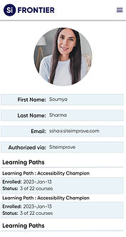
Profile Page


Final Design Prototypes

Landing Page

Catalog Page

Event Selection Page

Course Page

Profile Page

Certificate 1

Live - Training Page

Dashboard

Learning Path

Live Event Detail page

Search Page

Certificate 2


Accessibility
We played a crucial role in prioritizing accessibility and inclusivity throughout the entire website development process. In my capacity as the leader of the accessibility team, I spearheaded the implementation of WCAG 2.1 guidelines, meticulously adhering to both AA and AAA content standards. Our efforts extended to fine-tuning details like enhancing color contrast for better visibility and ensuring proper implementation of focus states for buttons, as well as optimizing the disabled states. This commitment to accessibility not only aligns with industry best practices but also contributes to a more user-friendly and welcoming digital environment for all users.


.png)
.png)

User Reviews


Challenges
-
Ensuring the website is optimized for various devices and screen sizes
-
Making sure the website is accessible and inclusive for all users, including those with disabilities
-
Balancing aesthetics and usability to create an engaging and functional website
-
Meeting deadlines and staying within budget constraints
-
Keeping up with the latest web design trends and technologies
Reflection
Throughout this project, I've gained valuable insights into the realm of UI/UX design. The challenges we tackled, from optimizing for diverse devices to ensuring inclusivity for all users, have honed my skills in balancing aesthetics with functionality. Navigating tight deadlines and budget constraints taught me effective project management, while staying abreast of design trends enriched my toolkit. This experience highlights the significance of user-centered approaches, innovative features, and adherence to accessibility standards. The successful transformation of the LMS reinforces the profound impact of thoughtful design on user engagement and satisfaction. As I continue in this dynamic field, I carry forward the lessons learned and the passion for crafting immersive digital experiences.